

Jeffrey Whittle's Celestial Bouquet and Crisha Yantis' Naively Skeptical(Detail)
Both Sides Now curated by John Lee Matney
The title of our exhibition comes from the song by Joni Mitchell, in turn inspired by Rudyard Kipling, by watching clouds, and by understanding the duality and self-doubt of her inner eye.
“I've looked at life from both sides now, from win and lose, and still somehow it's life's illusions I recall, I really don't know life at all" Joni Mitchell
The manifestations of Whittle's vision of parallel realities is intriguing on many levels. From the viewpoint of interior design, the use of vivid color with engaging subject matter is sophisticated. From the perspective of a museum exhibit the works raise questions about relationships between the self and the object and a distant unknown. Star-scapes, vast seas, flowers, and animals or paper boats with embedded maps chart encounters with layers of consciousness, time and distance revealing hidden relationships . The authenticity in the brushstrokes and mastery of color offer the viewer an experience that goes beyond photo-realism. Yantis’s sculptures raise more questions than they answer. The figures celebrate human imperfection and the sometimes awkward emotional states associated with differences. Her works can provoke anxiety and even humor but at the center is a thoughtfully designed piece of art. Yantis' blue glazes and applications of gold luster add another dimension that softens some of the tension and uncertainty in the relationships suggested in the figures. Yantis' hanging works such as Progression II inform Whittle's floating flowers and large moon in works like Ripple Effects and Celestial Bouquet which trace one of the more accessible entry points to understanding this collaboration.

Install at Linda Matney Gallery. Works shown are Jeffrey Whittle's Ripple Effects(far left), Crisha Yantis' Progression II (center) and Whittle's Celestial Bouquet(right)

Jeffrey Whittle, Ripple Effects
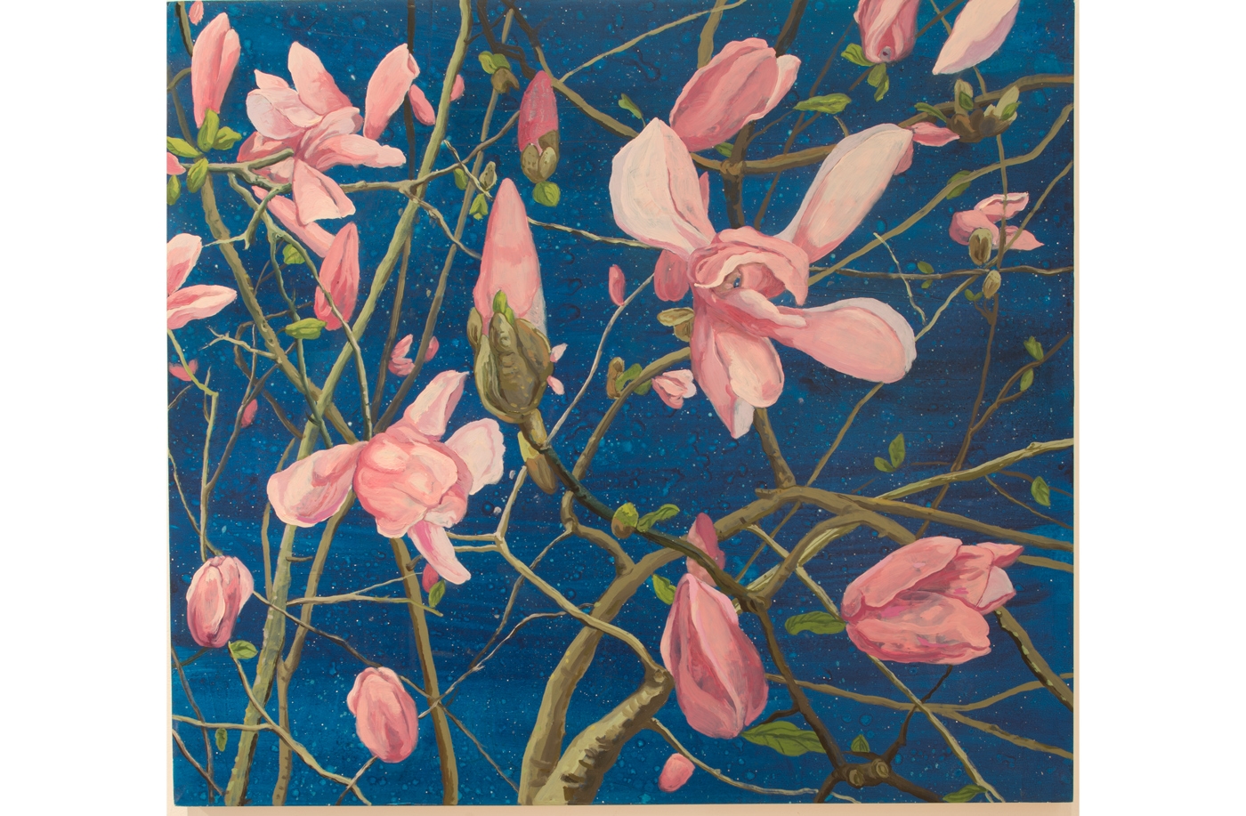
Jeffrey Whittle, Japanese Magnolia
JLM: Can you give you summarize what patrons can expect from your work in Both Sides Now?
My recent paintings explore beauty, love, and an expansive sense of time, by juxtaposing the ephemeral (flowering plants) with the infinite (star-scapes) my desire is to represent of both day time and night time simultaneously as well as the eternal/fleeting temporal experience. Twin figures are represented in the form of floating turtles, swimming/dancing elephants, disembodied blossoms and ghostly birds. Love is in the air and marks the map to self-awareness and creative growth.
Altered maps are prevalent and like paintings, maps create a world parallel to our own. A map can both tell us where we’ve been (or at least, where we think we’ve been) and help us to figure out where we want to go. But the destination is as often as not a figure of pure imagination containing the hopes and fears of the artist as well as the culture in which the artist works. In this sense, a map provides a unique canvas on which to explore the ways in which we structure our sense of place while searching for ways in which to imagine something else entirely different.

Jeffrey Whittle, Both Sides Now II
JLM: Comment on your Iconography as it applies to the paintings Both Sides Now and Infinity Encountered which are perhaps the most talked about paintings in the exhibit

Jeffrey Whittle, Both Sides Now
JW: I'm interested to in parallel worlds to our own. The painter creates their own language and world as do maps (synthetic / abstract depiction of the natural world.) Within nature there are secret worlds of animals and flora, with their own language and relationship logic.
My work uses animals as a stand in for humans and the iconography is not an equation that I can easily explain. I believe that I’m attempting to depict interiors of the Self usually by way of twins. Both Sides Now depicts twin elephants, opposite in color or in scale, representing oppositional forces within the self.
Early Italian Renaissance paintings (Giotto, Duccio, Lorenzetti, etc.) inform my work as do the Mughal periods in Indian miniature painting. The image of the intertwined elephants is a repeated form that is exotic to me. Twin forms represent connecting closely with another. The magnolias are another twin pairing in transformation while echoing the image of the lotus going in Indian miniature art (Infinity Encountered)

Jeffrey Whittle, Infinity Encountered
Additional Works by Jeffrey Whittle. Scroll to review or click through for additional informaion

________________________________________________________________________________________________________________

Crisha Yantis, Lustrous Progression
Interview with Crisha Yantis
JLM: What artists have influenced you - what else has influenced you?
CY: My first significant artistic influence was my undergraduate Professor Sunkoo Yuh at University of Georgia. I didn't know much about what could be done with clay prior to my undergraduate experience, I saw a show of his work when he first began teaching there and I had just moved to Athens and was thinking of becoming a student. His influence was a lot about the possibilities of how to construct with clay as well as to push your limits and work hard. As for influences of form I am drawn to simplified forms such as Cycladic figures, the Venus of Willendorf, figures painted on Mimbres pottery, many works by Paul Klee and his interest in color. The works of Stephen De Staebler interest me both formally and his content, specifically the lack of gender specificity, fragmented forms, timeless qualities, and concentration on the internal human struggle between life and death. There are so many more but it is hard to keep them fresh in my mind.
JLM: Explain your process and how it has developed over the last several years
CY: Often I begin with a drawing where I layout my ideas. If it is a wall piece I draw out the form on paper and see how it will interact with other figures around it in order to get an idea of what the footprint needs to be on the wall. I then hand build my forms using a rich reddish brown midrange clay that often has a significant amount of grog added to it for strength. I build up most areas by rolling a very rough and large coil and pounding it into a rough slab form, then I building up the form with various sized “slabs”. The heads are a very rough pinch pot form that I then build the faces onto. These methods are somewhat loose and complement my content. After some smoothing out of the surfaces I will add textures, slips, underglazes, or leave for glaze application. The larger forms I make in sections have an internal flange and come apart so I can fit them in my kiln and I can physically move them. The larger wall pieces will have a cleat built into the back so the attachment to the wall is secure. My process has been fairly consistent over the last several years but I have gotten better at planning ideas before beginning a work so it meets my intentions. Also I keep finding ways to manage my forms such that I’m not physically hurting my body. Currently I feel grad school really changed my work the most, helping me find myself and what I like, what’s important to me to represent and what I can let go of. For a long time, I thought I needed to represent the entire figure for some reason, now I’m working to find where form and the figure meet for me or how much needs to be represented to get to what I want to say. Of course this is all still very much in development and will be an evolving process.
JLM: Comment on your recent work "Distinctly Joined " it seems to be a departure from previous work. Comment on your floor pieces in general

Crisha Yantis, Distinctly Joined with detail(left)
.
CY: I like making works that don’t require a pedestal and can sit in a space in their own way. In part, the floor works are attempts at making that happen. I appreciate what a surface or pedestal has to offer a piece but it is also really freeing to find and use space in different ways. The floor pieces often have the heads meeting the ground, something I find slightly awkward. I think it’s a vulnerable place to be yet also the ideal way to enter the world at birth. Vulnerability is important because it seems to be the place where are minds and bodies are most open to fully experiencing our circumstances, which is scary but important. I felt the form of Distinctly Joined should push how I was looking at the interaction between the figures. I did this by addressing the top parts with abstract choices rather than the human face. So the bump on the right doesn’t fit or line up with the space of the form on the left, yet it seems as if it should and my mind wants it to. I liked the idea that they kind of line up but won’t ever fully fit or fulfill that space together, yet visually look like they are a pair. That is where relationship plays a role, a recognizing and thinking about how humans are all so very different even in our similarities.
JLM: Please comment on the Stage series-

Crisha Yantis, Stage 1
CY: I’ve repeated similar titles such as Stages and Progression because those words interest me as general commonalities amongst people. In this Stages group - the figures are again awkward in their presentation, dealing with gravity to some degree but just trying to navigate a general internal struggle or heaviness. The one sitting upright might seem the calmest and a goal to get to that point, but it takes the stages of shifting and seeing things in new positions. It’s very similar to Progression and moving forward, or to what we think is as forward. It’s hard to represent the internal feeling or experience of stages and progression visually-I imagine it’s something I will continue and it will be interesting to see how it shifts for me over time depending on what my experiences of the world around me.
JLM: Your work Progression II is from a previous serious. Please comment on this piece and the series. . How do you feel your work has changed since you created the piece? (Progression II is the middle part of a 3 groupings)

Crisha Yantis, Progression II
.
CY: Some of this I addressed above regarding stages because of the similar themes. I think Progression II reads on its own in some ways stronger then the full grouping of 3 does. Progression II is more about relationships or partnerships then just the self. How we evolve together, how our strengths and weaknesses influence or affect another. Works that can leave open questions and not answer everything are more interesting to me and in many ways my work has become more ambiguous or at least I work towards achieving that. The full series of Progression II reads less ambiguous to me then the single pair does. I don’t know that it has changed a whole lot from that particular piece; I’m definitely still working out those ideas. Ambiguity is very important to me in terms of content. I find being less direct can leave more room for others to experience and make more interesting work. Why spell out all the details? It’s harder to live with ambiguity, our nature as humans is to find all the answers, it is so uncomfortable to not have direct answers. I like that discomfort and I dislike it all at the same time. So I work through it while making. It’s not always clear to me if I’m achieving that but it’s part of what I’m thinking about in the stages and progression series I’ve played with and hopefully I’ll get closer to it.
JLM: Comment on Works such as Barnacles, Lustrous Progression and Playing Field that emphasize multiples. I was intrigued by your use of gold luster, the appendages on figures, and the clouds below the figures on Playing Field. In some cases, limbs are missing or incomplete which is also seen in other works in the exhibit such as Progression II and the Stage series- please comment on these elements as well as the clouds.

Crisha Yantis, Barnacles (detail)
Barnacles and Lustrous Progression have some new elements I’ve been working with. Barnacles are the first work I’ve done that looks at relationships that are new to me, in this case my relationship as a mother. I’ve always really enjoyed my own personal space and now I have this little being attached to me almost all the time. It’s awkward and amazing and I’m completely emotionally attached. In this case I think the missing limbs and incomplete or simplified forms highlight a bit of the helplessness of each. The characters are partially reliant on the other. I also think the form is more lovely with simplified areas and arms don’t seem important to me psychologically. Similarly, with Lustrous Progression but each are paired to sort of work together. The pairs are missing arms in the middle - illustrating a relationship of togetherness, reliance, and bonding. The gold luster was something I’ve really wanted to try in part because I like the way it reads with a mostly bare clay, (there is a little glaze warming up the clay body) Also I didn’t know much about how to use gold luster and wanted to learn how it reads on sculptures and if there was a way it could inform my content. It is so rich, beautiful and very particular to work with. It makes something more precious but I’ve never been drawn to gold so I’m sort of learning how it achieves that.

Crisha Yantis, Playing Field
The clouds in Playing field help give the work a different context. Instead of being in space it tells you the characters are in a more specific place, they change the location of the figures. I think they add playfulness to the figures that I don’t always give to my work but am still often drawn to the playful setting. There is a bit of anxiety over most of my figures and I think the clouds offer a balance of that anxiety in this work. They sort of lighten it a bit. It’s probably more comfortable for me to bring those two together while still addressing issues I want to look at. The figures each are lacking something the other figure has, a bit of a celebration or recognition that we all share different strengths.
JLM: Is there anything else you would like to add about your work and how it interacts with the works of Jeffrey Whittle?
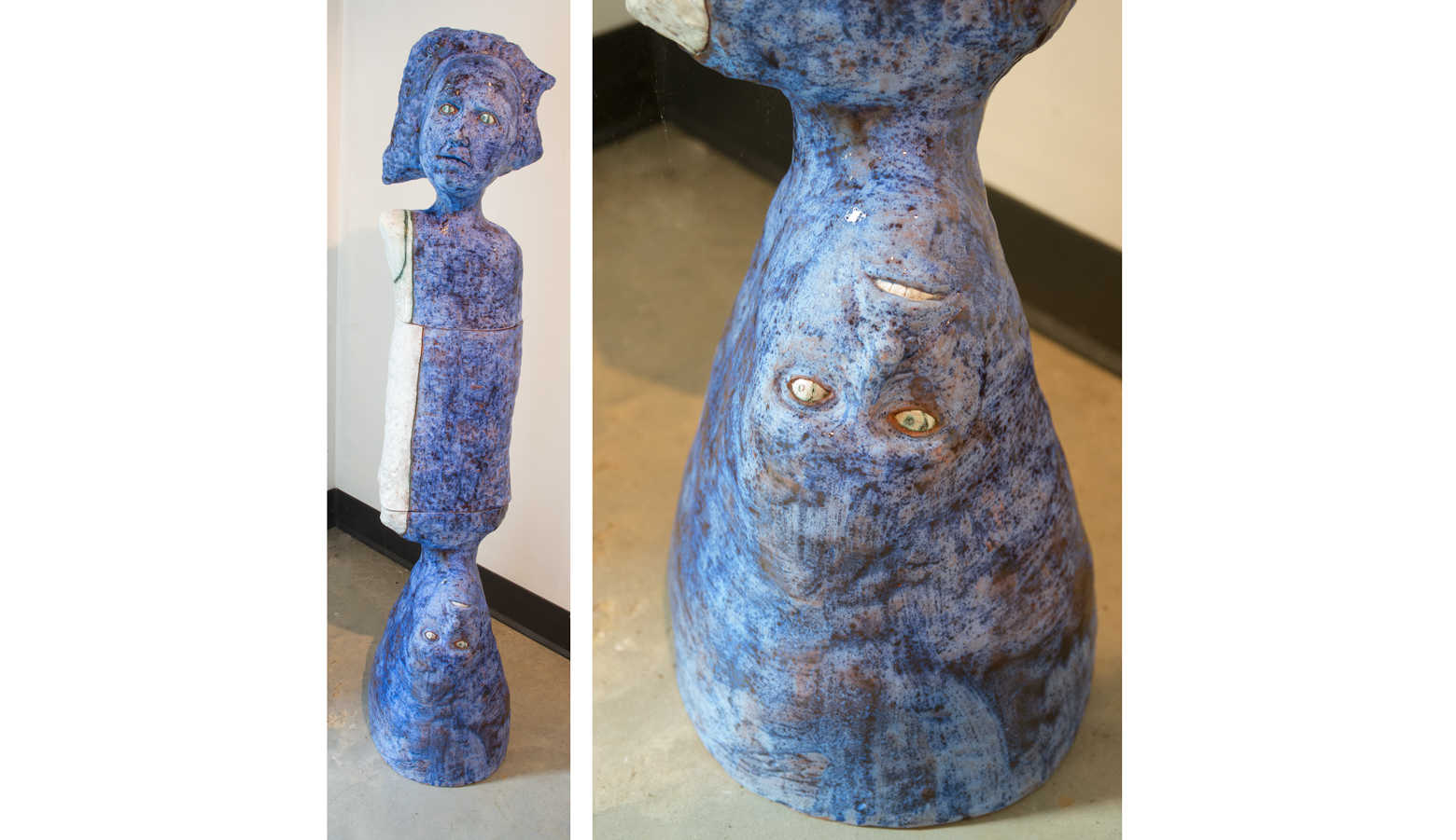
Crisha Yantis, Naively Skeptical
CY: I haven’t seen the works together in person so I’m using my imagination a little here from what I’ve seen in photos. I think the colors really inform each other. Many of Jeffrey’s works seem to use rich vivid colors, so I imagine it would sit well next to the way I break color up with neither being obtrusive to the other but instead his paintings give a world the figures could almost exist in. There is a similar subject matter of internal contemplation in both our works. I’m not typically drawn to foliage works but Jeffrey has a way of approaching the lighting and color that I find really lovely, the backgrounds are nightly while the foregrounds are highlighted suggesting dualities that are similar themes in my works. Also I think in both our works there is beauty or a theme of delight that is an underlying element enhancing the works.


